I don't normally post on the weekend, but I wanted to share this.
Ten years ago today, my maternal grandmother passed away. From her, I inherited a love of sewing, knitting, and crochet, and if reports are to be believed, the bulk of my personality traits.
Sadly, she lived 2,000 miles away in Canada, and I only got to see her once every few years. She had a really thick accent, so in high school I took French so that we could communicate better. She died just after my freshman year, just as I was finally able to carry on a brief conversation in the language.
One of the few items I was able to keep after the passed away was a Canadian flag she had stored in a wooden box. The box was damaged and had to be thrown away, but the flag was in perfect condition. It hung in my dorm room all through college, and when I began doing study abroad trips it became a tradition to buy a flag from every country I visited.
I re-did that maple leaf four times before I gave up. For some reason that red takes forever to dry when I use it plain, but it won't stay wet long enough when I try to freehand. I had better luck with the Quick-Dri.
I bawled all through her funeral and had to stay in the car during the burial. But as we were driving back to the hotel, through the streets of St. Jean, I remember thinking, "I'm home. Despite all of this bad stuff that is going on, I'm home." It was that moment that started my obsession with Canada, and sparked my desire to one day live there.
There is a song that always makes my mom and I think of her. It's one of those things where she would either laugh her head off if she heard it, or be really offended. When I got my license the year after she died, this song was playing every time I started the engine for six months. When my mom and I went out, we heard it in the shops or in the car. Now, ten years later, it never fails to play on our sound system at work when I am having a bad day. It's an older song now and doesn't tend to get as much air time, but every time I think of her I hear it playing somewhere shortly after. Mom and I decided she likes the song.
Rest in Peace, Grandma:
--- Colors used: Pure Ice "Siren" (red) Maybelline Color Show "Porcelain Party" (white) Pure Ice dries too quickly for freehanding, so I used Sally Hansen Diamond Strength in "Diamonds and Rubies" for the maple leaf.
Initially, I wasn't going to do a Friday Finds segment this week because pennies are pretty tight right now, but I picked up a couple of things at Target yesterday and thought I would share.
Essie Set in Stones ($7.79, Target) Sally Hansen Insta-Dri in Lightening and Just in Lime ($3.69, Target) Burt's Bees Lemon Butter Cuticle Cream ($5.99, Target)
I'm really excited by the Essie. First, I only own one other glitter polish (I know, some of you just gasped in shock), but I really couldn't resist the call of silver glitter. Up until yesterday, the only place I'd ever seen Essie was Giant Eagle, and I didn't even know they carried it until last week. Then it popped up at Target ($. 21 cheaper, I might add). I've been seeing so many Essie swatches around, and I really wanted to try it out. Sometimes I feel like an ad for Sally Hansen, since that's normally all I see around here.
I've used the cuticle balm a couple of times, so I can't give a review of it yet but it smells good enough to eat.
July 1 starts the Summer Fun challenge of at Red Hair and Black Nail Polish, and you'll get to see a bit of the Insta-Dri colors then, as well as my thoughts on them.
Canadian Nail Fanatic made my inner goth squee a bit with this stamped manicure, and for my inner girly girl there's these butterflies from Clothes, Cosmetics, and Chat.
Of course, Nailasaurus had to up the ante with her contribution to this week's Heroes and Villians challenge with her Queen of Hearts theme, and she certainly wasn't kidding with her Perfect Paisley, but I think that Charlotte's Nails kind of trumped us all. Speaking of freehand, did you see this adorable Tucan?
This red and white manicure from Canadian Nail Fanatic is 100% classy. I love the glitter tips and the stamping!
Last, does anyone follow the Cosmo youtube channel? I don't, but I came across this video about nail art this week. They're all pretty basic. And in the world of nail blogging, this is all old news, right? Still, it's kind of cool to see it in the "news."
Keeping with the gradient theme, I tried to to another one. This time, it didn't turn out quite so well. I got kind of a cool effect, but I was sort of pissed off when I was working on it and I might have taken it out on the nail polish.
I used Sally Hansen Hard as Nails Xtreme Wear in Fuchsia Power for the base, and Insta-Dri Fast Dry Nail Color in Blue By for the gradient.
Note to self: Don't take out your frustrations on your manicure. I have the same complaint about Fuchsia Power that I do about the entire Xtreme Wear line: It's quite sheer and takes forever to dry. There are at least two coats in these photos. I think on some of my nails (mainly on the right hand, though) I did a third coat just before doing the gradient because it was too streaky and I could still see nail through it.
It also didn't mix very well with the blue for some reason, which made the application very difficult. In the end I did a layer of blended color, followed by one where I just sponged on blue by itself. To top it off, I had tip wear and chips within 24 hours, even with a top coat. Grr.
I think I'm just going to swatch for the rest of this week.
:) I had to. I love both the movie and that song. And it's so appropriate for this post.
And really, is there anyone better to represent a beauty blog than Elle Woods?
But seriously, it was just so right for this post, since I'm reviewing the "Oh So Bright" collection from The Balm. For starters, who can resist the packaging? Vintage pinups combined with funny play-on-word titles like Shady Lady, Staniac, and Meet Matt(e)--hell yes!
I've been eying this stuff for ages, but kept talking myself out of it because more than once I've been known to buy something based on the packaging only to be disappointed. For another, I don't like trying strange makeup since I'm allergic to a lot of it. It's really had for me to find makeup in a good consistency that contains neither fragrances nor soy (eventually I'll write a little more about that, but not today). Mostly I've seen the kits at Marshalls, and there will be one or two things in them that I like, but the others are either high in the allergy potential (like mascara) or just aren't my thing.
Then I found this kit.
To begin with, let's look at the cosmetic bag it comes in: cute and reusable, both plusses. Second, do you see the MSRP in the upper right hand corner? $59. That is more than I spend on gas in a week. It's more than I spend on food.
BUT, if you're a bargin hunter, you can find these kits for $10 or less. Mine was $9.99 at Marshalls.
So, packaging: 10. Price: 11! Let's look at the contents, shall we? First up, the Mary-Lou Manizer.
I passed on this kit a couple of times because I don't use luminizer, but the package says it can also be used as an eyeshadow. So I thought, What the hell? I'll give it a shot.
In the compact, it's a nice brown with some gold tones to it--almost the same color as my skin when I have a little bit of a tan (like right now). "Ah," I thought, "Another nice brown eyeshadow." Because browns are my favorite. I like a natural look that doesn't smack you over the head. Yes, I like to mix it up some, but for work I go pretty neutral in my makeup.
I swept on just a touch using the Mini Buki brush that came in the kit, and WOW. It was so bright! A great golden tan, it went on really nice (I did have to even it out a little with my finger since I'm not used to using a brush like that on my eyes). I love the color. It is so perfect, and could be good with day or evening looks. Bonus: it'll work great with the eye shadows I already have.
Next up, a Pump Your Pucker lip gloss called Pink My Lemonade, which is just the cutest title ever. Shimmery and semi-transparent, it's just a couple of shades darker than my natural lips, and the texture is awesome. It's smooth, and after a couple of minutes it's not nearly as sticky as most of the other lip glosses I've tried--which happens to be my pet peeve with lip gloss. I can easily see myself wearing this both on it's own and layered over my favorite lip stain. In fact, I wore both the gloss and the luminizer to my birthday dinner on Sunday, and then to work the next day. Swatches of the lip gloss and luminizer. The luminizer shows up a lot better on my eyes, but I'm not quite ready to start posting pictures of my face, even in part.
Last, we have a Hot Ticket nail polish. The color is "Princess." It's a nude base with pearly shimmer in it. It went on super easy. Dry time was pretty average (about 15 minutes), so if you're in a hurry it would benefit from a quick dry top coat.
I'm not real big on nude polishes of any sort, but I can see this color being a useful one to have in my palette. It's a little translucent for my taste as well. Here you can see two coats. Overall, I thought the color was kind of blah, but like I said, I'm not a big fan of the nudes or the pearly colors, but I like the formula and would like to try it in a different color. It is 3 free.
I loved this set and would definitely buy everything in it again--though like I said, different color on the polish. It got me really wanting to try some of their other products, and I'll be looking at the more closely when I see them around now. The more I use them, the more I can't believe what a deal I got! The Mary-Lou Manizer alone sells for $22 on their website, so to get the whole kit for $10 is a steal, even if you take brand name out of it and just look at the quality of the products. I doubt I could have gotten a shadow, gloss, brush, and polish of this quality from Target even if I was buying the store brand (and y'all know how I love my Target). I don't think I could ever consider paying the full retail for it, though, which is sad because I like supporting good companies. I think the most I'd be able to stomach would be $30, but that's speaking from my end of the shoestring. Your mileage might be different.
If you haven't tried anything by The Balm, I highly encourage you to. Also, check out their website, since the company is peopled by some fabulous ladies and dogs!
Maleficent is probably the greatest evil queen of all time, and she's frequently referenced as being the Most Evil Villain Ever. And what would the Most Evil wear on her nails?
Something simple and elegant, I think. But with a bit of an edge.
I've been wanting to try a gradient again, ever since my last botched attempt. This time I used a cosmetic sponge (half of one, actually. Waste not, want not). It came out sooo much better this time around.
I used that new Milani I showed you last week for the base. I did three coats, then topped it off with Sally Hansen Diamond Strength Instant Nail Hardener. While writing Friday's post, I was interrupted and had to go out before I could apply my topcoat. Without it, this color is very easily damaged. The next morning, I was able to do the gradient. The black is Pure Ice "Touch Me Here," and I polished it all off with my quick dry top coat.
I just love this mani. The purple gets some really great depth once you add a top coat, and the addition of a gradient makes it even more so. Writing this, I just keep stopping to look at it. It'll be a shame to take it off for the hero portion!
It is shockingly easy to go from one thing to another when beauty blogging. At first, I just wanted to talk about manicures. But that got into nail polishes, and all those pictures of my hands meant I had to work on my cuticles, which then made me think about lotions, and then...
Well, you can see what I mean. Everything is connected! It's kind of beautiful, like a well constructed tapestry.
So, with that in mind, I thought that I might share my thoughts on a few products I've finished up in the last couple of weeks:
We'll start on the left, with the Up & Up Women's Shave Gel. I don't remember what I paid for it, but it was less than $2 at Target. I really like the texture of the gel, which is very smooth and has a good lather to it--it also stays in place a lot better than other products I've tried. This was also the first shaving gel I've tried that actually made a difference in my skin (granted, it's been a few years. Yeah, that's how unimpressed I was before). I gave this a shot out of desperation, because my skin was so dry and no amount of lotion seemed to help. It also made my razor bumps go away within a week or two, and those have ALWAYS been a problem for me, even when I tried using shaving products in the past. As a bonus, it's got a really good, very light scent which I love. I would definitely buy this again.
In the middle we have the Up & Up Strengthening nail polish remover. I'm not going to talk about this one here, because I already added a review to my stash page (<---The link is in the sidebar).
Lastly, Color Me Sexy Volumizing Conditioner. I bought this at Marshalls probably three years ago. I'd seen it at work and heard good things about the brand, so when I saw a set of shampoo, conditioner, and leave in conditioner on sale for what I would normally pay for just my shampoo and conditioner, I decided to try it out--especially since I don't dye my hair as often as I need to and want to preserve the color, and like most girls with straight, fine hair, it's hard for me to get volume without frizz.
My overall feelings about this...meh. For starters, this product smells a bit like black licorice. Points for being unusual are quickly negated by the fact that it's the one candy I absolutely can't stand. It took me a few tries to get used to it, which is one reason it took me so long to use this up. I actually finished the shampoo over a year ago (it was more tolerable when I was washing it out) but I think I still wound up throwing out some of it, based solely on the smell. Did it help my color last? Yeah, I guess...but no more than any other shampoo for color treated hair on the market.
Then we get to the conditioners. The only reason I held on to these is because I hate throwing out things that might still be useful, and I was loathe to replace them when I still had some left.
Eventually, I got used to the conditioner and it didn't bother me any more. My #1 peeve with this one was that it's SUPER thick. Like, can't hardly get it out of the bottle thick. Like, take off the dispenser top, squeeze it out through the neck, and wind up with a cylindrical chunk of conditioner that holds it's shape in the shower. Eventually, in frustration, I squirted about a quarter of the regular conditioner into the leave in conditioner bottle, and then added water until I got a consistency I liked and could work with. This stuff was so thick that I started using it as a leave it treatment, but even then I had to thin it out quite a bit because it left a residue on my hair. What I finally ended up with was something slightly thicker than the Garnier Sleek and Shine leave in--and while I could finally squirt it out through the cap, it still held it's shape even when exposed to water. I'm telling you, you could sculpt with this stuff.
As for the leave in...I still have some of it left. It's okay. It's a spray-on treatment that really only seemed to work after I added some of that super-thick conditioner to it. Out of the three, this is the one I like the best.
Did it give me volume? A bit. But I still had lots of problems with frizz. Overall? Wouldn't buy it again, and I can't wait to go back to my standard shampoo and conditioner.
I need a rating system of some sort, like the Hammie points on Polished Indulgence. :| Any suggestions? (speaking of which, I clicked on Hammie to find out where she got him and found this adorable dog. He reminds me of my baby, Sam, who resides with my mom and dad.)
I toned it down a little this week, but there were still a couple of things that I just couldn't resist: "Oh So Bright" collection by The Balm ($9.99, Marshalls) Ladies Emergency kit (purchased mostly because of the adorable tin. I just couldn't say no!) $2.99 Marshalls Top Care strengthening nail polish remover ($1.29, Giant Eagle) Wet n Wild Megalast in On a Trip (light purple; $.99, Giant Eagle) Wet n Wild Wild Shine in Metallica ($1.99, Giant Eagle) Milani Neon in Rad Purple ($3.99, Giant Eagle)
Today I had to run in to Giant Eagle, and since I needed more polish remover I decided to take a look in their health and beauty section. I'd actually never gone in there, since I'm not overly particular about most of it and things like shampoo, lotion, and polish remover are usually cheaper at Target or Walmart, but oh my god. I feel kind of dumb now.
Here I was thinking that I would have to got to Sally's and spend an arm and a leg on acetone, Seche Vite, Essie, OPI and Orly (none of which I've had a chance to try yet) and they were all right there. Our local Walmart carries Sally Hansen, Pure Ice, and a few other lower end brands that are generally picked over (the last time I saw a full display at a Walmart was the grand opening of the one out by my parents' house). Target carries fewer brands, but they're usually better stocked. Giant Eagle was sold out of some stuff, but for the most part it was all there. They had limited edition lines from a couple of manufacturers (like Wet n Wild and Essie), and a range of colors in brands that I thought were more high end and would only be available online or through specialty stores (please note: I consider anything "high end" when it is over $5.99 a bottle. Remember, I'm on half a shoestring budget here).
Even though I was drooling, I had to resist the urge to load up my basket with polishes, even though I could almost justify some of them simply because I'm still building my palette, so to speak. The one color I could justify was a dark, creme purple. I didn't have a brand in mind, I just needed a dark purple for my next Heroes V. Villians mani, and since my black is a creme I wanted the purple to be as well. I have two creme purples, but they're pastel. My dark purple is pearlescent.
The only darker purple I could find that didn't contain glitz in one form or another was Milani Neon #506 Rad Purple. It was a little lighter in the bottle than I was looking for, but crunched for time and cash, I decided it would have to do. The formula is extremely thin, almost watery. I wasn't expecting it, and it gave me some problems on the first coat. By the second I started to get the hang of it.
Because it's so thin, though, this polish tends to spread which eliminates most of the brushstrokes and it dries super fast--almost instantly for thin coats, and in less than ten minutes for thick coats (I didn't time it exactly; might even be less). Once dry, it's pretty matte, so I added a layer of my Diamond Strength Instant Nail Hardener (on Monday, I'll talk a little bit more about my topcoats and treatments, by the way).
Also note the drastic color difference between bottle and nail. I used three coats for these shots, and just so you can see the comparison, there is one coat of top coat only on my index finger.
I really like the final color, which is much more red than the bottle color (while still being a vibrant, rich purple). The final color is more like what I was looking for in the first place, but I can see this being annoying with other colors if you're expecting one thing and get something VERY different. For my purposes, however, no complaints!
I couldn't decide on one Titan to illustrate for this manicure (that'd be pretty boring, wouldn't it?) So I decided to do all five. Colors used: Sally Hansen Hard as Nails Xtreme Wear #300 White On Sally Hansen Insta-Dri Fast Dry Nail Color in Blue By! Pure Ice in Touch Me Here Pure Ice in Siren Maybelline Color Show in Plum Paradise Wet n Wild Megalast #213C On A Trip
I used BlueBy, On a Trip, and Siren as my basecoats. I didn't have a light enough blue for cyborg, so I mixed equal parts of Blue By and White On. I used a few different techniques for the detailing. Scotch tape masking, dotting for the circular elements, some refining with my nail pens, and a whole lot of freehanding. Unlike the other base colors I used, the Wet n Wild On a Trip didn't bubble thanks to the heat and humidity we've been having, and I didn't have any trouble getting it to dry.
That humidity is the reason I think I'm going to be swatching for a few weeks instead of doing nail art. It's been nearly impossible for me to get regular colors to dry and dry well. *sigh* I might not be able to do the summer challenge after all.
But! I've still got one more week of Heroes v. Villians, so stay tuned for that!
Just a few of the things endangering my wallet this week:
Spotted Polish I'd never heard of this until someone mentioned it and linked to Cherry Nail Art. I think it's the coolest thing since crackle lacquer. color change nail polish Need I say more?
Oz colored glitter Have I mentioned that I'm a HUGE Wizard of Oz fan? Well, I am. And the new Jordana Glitters in Red Blaze and Galaxy look just right for a stroll down the yellow brick road! You can see better swatches here.
Chrome I want this as a birthday present to me. Chrome is one of my favorite nail polishes, but I haven't seen it in forever, until Imperfectly Painted recommended Cassie Cosmetics for discontinued colors. This lot contains the whole line, and makes me a little giddy.
Arabian Night Speaking of Imperfectly Painted, the color she found at Cassie was Arabian Night, and I think I understand her five year search now! Purple and gold? I'm all over that. Isn't it gorgeous? I need to track down a bottle now!
OPI Spiderman I have yet to see it in stores, but I really want to get my hands on it, just for the sake of the color names alone. I really want Shatter the Scales and Your Web or Mine, but my favorite names are probably My Boyfriend Scales Walls and Number One Nemesis. I'm also jonesing for their Nail Envy and Ridge Filler, which I've never tried before but heard good things about.
I decided to go with another cartoon variant this week, rather than a blockbuster. Teen Titans was my favorite cartoon to watch in high school and college even trumping a good deal of the anime that got me through mountains of school work, and Slade lends himself perfectly to doing nail art. Polishes used: Pure Ice in Siren and Touch Me Here as a base Wet n' Wild Wild Shine in Metallica for the diagonal stripe POP Beauty Split Silver crackle coat teeny tiny dots of Sally Hansen Hard as Nails Xtreme Wear #300 White On for the eyes (outlined in Touch Me Here with a nail brush) Sally Hansen Diamond Strength Instant Nail Hardener as a top coat This is the manicure that almost didn't happen. I started working on it Saturday night, and didn't finish it until the wee hours of Monday morning.
The first time I attempted, I was tired and distracted and kept screwing up the pattern--nails that should have had a black base ended up red, my edges were extremely sloppy, even for me, and even after two hours it wouldn't dry because it's been so hot and humid around here. Even when I thought it was finally dry and went to bed, I woke up the next morning to find imprints from the sheets stuck in the polish. So I took it all off and started again.
This time I waited a minimum of 30 minutes between coats, after discovering that my quick dry top coat would not work in this situation (more on that later this week). I held my nails in front of a fan, and by then the AC had been on for 24 hours which helped with the humidity. I did the alternating red and black nails, then left them overnight.
I forgot, however, to apply a top coat of any kind, and by the time I got back from work I had some tip wear and nicks. I applied an extra thin coat of polish where it was needed, wrapped all my tips, and then started on the decorative bits (at last!). I used scotch tape as a mask on all of the two-tone nails and the diagonal stripe, and finished it all off with a top coat (I used two coats on the crackle, just because of the uneven texture. I'll be writing about that later this week, too).
After all of that, it just makes me more pleased with the final result. I love the two-tone effects (the two-tone crackle was a spur of the moment thing), and I love the color scheme. I'm really hoping this one lasts a while--it'll be a shame to take it off for HvV #4!
I'm starting to think that I might have to break down and get a Pintrest account to keep track of all of the awesome manicures I keep seeing. Here are a couple that really got me this week:
Thanks to a link on...I don't remember where, I've started following a French nail blogger, and I just love her one stroke hibiscus. More motivation to work on my French!
Those are the ones that stand out to me this week. I love seeing all of the creative things that people do with nail polish. I have got to improve my skills to catch up with all of you wonderful people!
There is a small, slight chance -- tiny, really -- that I've gone a little overboard this week.
I just couldn't help myself. I was so excited by all the blogs I've been reading, and the tutorials, and having this new blog myself.
So, here's the breakdown, from left to right: Pop Beauty Nail Glam kit with #4 Black and #58 Split Silver (crackle coat). ($4.99, Marshalls) Modella Purse kit with flamingo pattern (because I had to. See below) ($2.89, Walmart) Winning Nails #704306 nail art brush ($4.79, Sally's Beauty Supply) Maybeline Color Show in #380 Porcelain Party and #280 Plum Paradise ($2.89 each, Walmart) Color Zone Set including a clear glitter, a florescent glitter pink, and a florescent glitter purple (color names/numbers were nowhere on the packaging or bottles, oddly enough) ($4.99, Marshalls) Up & Up set of 32 Cosmetic Wedges ($1, Target) Sally Hansen Insta-Dri anti-chip top coat ($4.49, Target) China Glaze Celtic Sun ($6.49 Sally's Beauty Supply)
Not pictured: Sally Hansen Insta-Dri in Blue By! ($3.59, Target) Sally Hansen Maximum Growth Cuticle Pen ($5.99, Target)
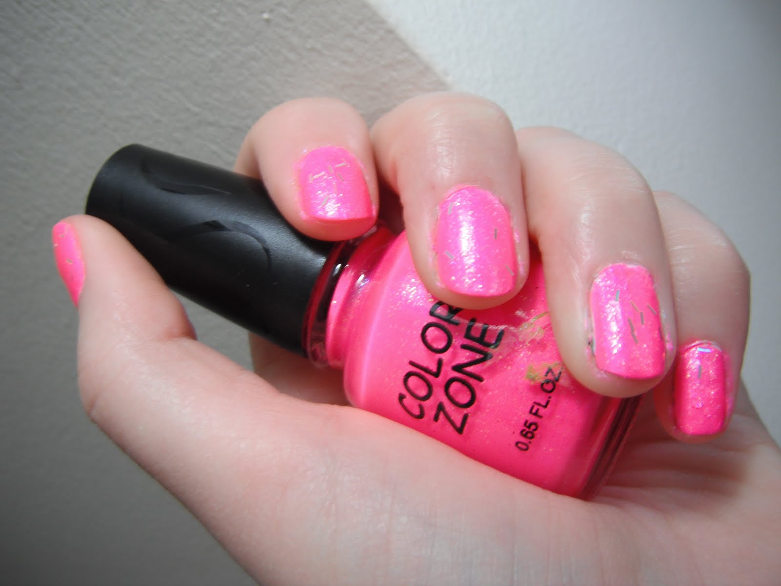
Whew! That should keep me busy. I've been dying to get my hands on some florescent colors ever since I saw this manicure, so that's what I was most excited about. My camera really doesn't like bright things, so it doesn't quite do these colors justice, especially the pink. The second photo is a bit closer to the truth:
I tried swatching the pink this morning, and this is what came out:
That's three coats of the Color Zone pink over 1 coat of the Porcelain Party, topped with the glitter.
Both of these colors are rather streaky and sheer (I'll talk more about the white when I swatch it by itself). The pink is both thin and kind of gloopy, which is an odd combination. It makes it very difficult to apply evenly, and in order to really get the color to pop you MUST have a white basecoat. If I ever use this color straight again, I'll do two coats of white and two of the pink (though I might still need three), just to give it a really good base. As you can see in this swatch, even after three coats, you can still see where the white base didn't completely cover the nail, so I've got some streaks that still show through.
It dried almost instantly, which I like (though I did have the desk fan going at the time, and that probably helped a bit), and was nice and bright without being blinding. The tiny amount of glitter in this polish seems to add more of a texture than a sparkle; most of it winds up being covered by the polish rather than on top of it, so just for kicks I took the clear glitter and put that on top. Even though there's a good amount of glitter in the pot, it was more content to stay on the brush than on my nails. It did add a little much-needed shine, but not as much as I had hoped, and it helped a little with the bumpiness of the glitter.
Overall, I found it disappointing, but I'm reserving final judgement until after I do the water marble.
I did do a little research on Color Zone for this post -- or at least I tried. They don't seem to have a website, nor does their parent company, Blue Cross Beauty Products. So the color names/numbers shall remain a mystery for the time being.
*I love flamingos, I collect all things tropical, and as I found out this week, my first short story, "Birds of a Feather", which is about a Wereflamingo (yes, a Wereflamingo) will be published on July 11! So this was a bit of a celebratory splurge. :)
The X-Men cartoon premiered in 1992, when I was five years old. Searching for reference shots for this week's challenge, I started watching it again on Netflix, and oh my god. This explains so much about me. The propensity for quoting things, the "accept everyone" attitude--and my love of strong female heroines, leather jackets, multi-color hair, hip belts that have better things to do than hold up your pants, and knee high boots.
It's that later bit that inspired this manicure: Rogue.
(I'm so glad my nails aren't magnified like that in real life. They look so much neater when they aren't two inches from your face.)
For this one, I used three coats of China Glaze "Celtic Sun" for a base (more on that in a minute), and Sinful Colors Professional in #946 Happy Ending (x2) for the green stripes. For the black accents I used my black Claire's Nail Art Pen. For the accent nail, I used Pure Ice "Siren" with a streak of Sally Hansen Hard as Nails Xtreme Wear in #300 White On. I topped it all off with Sally Hansen Insta-Dri Anti-Chip Top Coat, and can I just say, it's my new favorite top coat?
I think Rogue and Mystique make great foils for this challenge, since Mystique was once Rogue's foster mother (at least in the mythology of the original cartoon. With all of the revamps that have happened in the last twenty years, I don't know if this is still true).
This was my first real introduction to comics, and I really feel that the X-Men story is one that we need right now--the message that no matter what our differences are, we can still live together in peace, and that a little tolerance can go a long way.
This was my first time trying anything by China Glaze. Here you can see my nails before I added the accents:
That's two coats of Siren and three of Celtic Sun. My camera doesn't like bright things very much, so it really doesn't show that this is a highlighter yellow. It's also very sheer, even with three layers, and I had some trouble applying it. It was difficult to get an even coat, and when the brush passed over a previously painted area there was an issue of balding. I'm glad I used it as a base, since covering it with the green made the unevenness less noticeable. I think this is another color that would benefit from having a white basecoat.
I also had some issues with the brush. One of the strands hadn't been cut, so I had to do that myself.
I know that everyone else really seems to love these summer florescent, but so far I'm not crazy about them. I guess I'm more into the dark, iridescent colors, and those are the textures I tend to go for.
I spent this morning searching the internet for new blogs. Damn, there are some creative people out there! I can only hope to eventually get that good at this (I'm sure it helps that a lot of them do this professionally, while I just do it for fun). One of the new blogs I decided to follow was Red Hair and Black Nail Polish. The title just sounds so like me, especially in high school. Come July she'll be hosting a summer challenge to do a new manicure (theme provided) every other day. it sounds like a lot of fun, so I'd like to give it a shot. I don't know that I'll be able to do every challenge, but I at least want to hit most of them. It does, however, mean that I'll likely be skipping the last week of the Heroes vs Villians challenge.
I wasn't ready to take off my gradient manicure yet, so I decided to play around with a pedicure. I like pedicures because the big toe gives me a larger canvas, and pedicures seem to last forever--at least for me. I'm not as particular about my feet in terms of how they look, but I do have a preference for super short nails on my toes. It's a pet peeve. Drives me nuts if there's any superfluous length on them. But, that means it's generally pretty quick to paint them. I used all Sally Hansen Hard as Nails Xtreme wear for this manicure. I skipped the nail growth activator (for obvious reasons) and the clear base coat and dove straight in with two coats of #270 Lacey Lilac. This polish doesn't even pretend to be a one-coater, and I've noticed when using it on my fingers that it can be kind of streaky and sheer even after two coats. For my toes, however, I wasn't overly concerned.
Once that was done, I made dot flowers out of #320 Fuchsia Power with #150 Sun Kissed for the center. I used a bead-ended sewing pin to make the dots and in the process discovered that the solvent in the nail polish removed the pigment from the bead. Next time, I'll be using just a metal pin, or, hopefully, I'll have a dotting tool. The last time I tried to do anything with dots I was just using the brush that came with the polish, which was very messy looking. Much better results. I don't know why it didn't occur to me before to use different tools. Maybe I'm just slow. :)
After the flowers, I finished with a coat of my standard Diamond Strength Nail Hardener. I think it might be time to retire this one, though, because I noticed it's rather yellow in the bottle (it's several years old). It doesn't seem to affect it on the nail too much, but it's likely the cause of that greenish tint I noticed on my manicure. Ah, poor me. I'll have to go polish shopping sometime soon.
So I'm sure that by now everyone has heard of the Heroes vs Villains challenge Nailasaurus posted about yesterday. As soon as I saw that post, I had to take part.
Week 1 is Marvel themed. When I was a kid, one of my favorite cartoons was X-Men, so for this one I picked two of my favorite characters from that world.
I started with my usual prep work* ( Natural Nail Growth Activator and Diamond Strength Instant Nail hardener), with one addition. My cuticles have been driving me nuts for the last few weeks, so I broke down and got something to help treat them. Target didn't have a lot of options, though, so I went with the Maximum Growth Cuticle Pen. I've only used it once so far, but I'll let you know how I like it once I've had it a little longer.
For the base of the nails, I did my pinky, middle, and thumb with Insta-Dri in Blue By! (1 coat), and my ring and index fingers in Hard as Nails Xtreme wear #300 White On (2 coats). On my ring fingers, I used a watermarble technique to illustrate her transformative power. It was my first time trying it, and while it didn't come out the way I wanted I still think it's pretty cool. Clean up is a bitch, though.
The eyes are the tiniest dabs of Hard as Nails Xtreme Wear in Mellow Yellow, Mystique's hair is a coat of Pure Ice "Siren" over a coat of White On, since I forgot to mask that bit off at the start. I just used Scotch tape cut to size for the masking. For the details on her dress, I used a Claire's Nail Design Pen (black). I finished everything off with a coat of my Diamond Strength clear coat (two, on the index fingers. The nail pens don't have a lot of staying power, even with a top coat).
I really loved the Insta-Dri polish. This was my first time using it and I really like the way it came out. It was a great, fast drying, single coat polish, and it was exactly the right shade for what I wanted to do.
Overall, I'm pleased with this manicure, but I wish I'd been able to come up with two more designs to replace the stripes with. I might still change out the pinkies once my brain isn't fried from being at work all day.
*All of the products I used for this manicure are by Sally Hansen, except for the Pure Ice "Siren."
I'm still so new to this world of fashion blogging, I feel like there are about a million years worth of posts that I need to get caught up on. I think I've added over a dozen blogs to my RSS reader in the past two days, and I keep searching for more.
I think the one that finally tipped me over the edge and got me blogging about nail art myself was Let Them Have Polish's China Glaze florescent watermarble. I don't even like neons in any form, be it clothing, polish, I'm not even that crazy about highlighters most of the time. But the pink and yellow in that one just made me squee and I HAD to try it.
Looking at the different blogs, there are so many things I want to try. I have a textile-themed manicure planned for some point in the future (after that water marble and a couple of comic/manga themed ones I want to do), and Nails in Nippon's tweed pattern would be perfect for that. I love the elegance of Copy That, Copy Cat's gloss-on-black manicure. I'm just stunned by some of her freehand designs, too!
Lastly, I'm saving the Morning Java swatch from Polish Insomniac. I love the color and when I finally figure out the steampunk manicure that I want to do (but have yet to design) I think that color is going to be involved. Its just perfect!
For my first Manicure of the Week, I really wanted to show off something cool and special.
Instead, I get to share a learning experience.
For this manicure, I followed the tutorial on Nailasaurus' blog. The problem is that Kroger was out of cosmetic sponges when I stopped by on the way home from work, so I settled for a regular kitchen sponge. In the process of doing this one, I realized rather quickly that I needed a sponge with smaller pores. I still think that these will be useful...but for something else. I might have been able to get a more gradual transition with more applications, but with dry time this design took almost three hours for all the coats I had to do:
1. I always treat my nails with Sally Hansen Natural Nail Growth Activator before I start [sadly, it is discontinued. But it appears there are a plethora of replacements available, such as this one]. It dries almost instantly and usually by the time I finish with the last finger the first is ready to be painted. When used regularly, it does help nails to grow. Right now I'm using it pretty frequently because my nails, which are usually rather weak and brittle, have been peeling horribly--worse than I've ever had before--so I'm trying to get some new, stronger nails to grow in.
2. Because my nails are so weak, I use Sally Hansen Diamond Strength Instant Nail Hardener as a base coat [again, discontinued, but I believe this is a similar if not identical formula]. It helps the polish last longer, and it helps my nails stay stronger after the polish is removed.
3. I put on two very thin coats of Sally Hansen Complete Salon Manicure in #440 "Calypso Blue." This is one of my favorite colors and I always get a lot of compliments on it. It is very sheer on it's own, however, hence the two coats. If I were wearing this color on it's own, I would have done up to four to get the desired effect.
4. For the dark end of the gradient, I mixed equal parts of Sally Hansen Hard as Nails Xtreme Wear in #25 "Night Lights" (this is starting to read like an infomercial, isn't it? While the line is still around, the color appears to have been discontinued) with Bari Cosmetic's Pure Ice in "Kiss Me Here." Once more, I think this color has been discontinued. When I looked it up to link for this post, it brought me to a page for what looks like a black glitter polish, and the bottle I have is a solid, beautiful, ebony black (they also charge $1.99 per bottle on their site, and I think I found it for 99 cents at Walmart a few years ago). The nearest one now available is Black Rage.
5. I then topped everything off with three more coats of the Nail Hardener, which helped even out the bumpiness of the gradient and provided a more uniform shine.
Next time, I want to try using matte colors, a better sponge, and I won't mix colors. First, it created an uneven tone at the tip of the nail, and where the black/glitter combo overlapped with the blue it created a sort of sick greenish color that I'm not crazy about. Still, the more I look at this manicure, the more I like it, even if it didn't come out quite the way I imagined.
It is also clear that I need to invest in a quick dry top coat--the question is, which one? I had one a very, very long time ago but never really noticed a difference with or without it. Do they actually work?
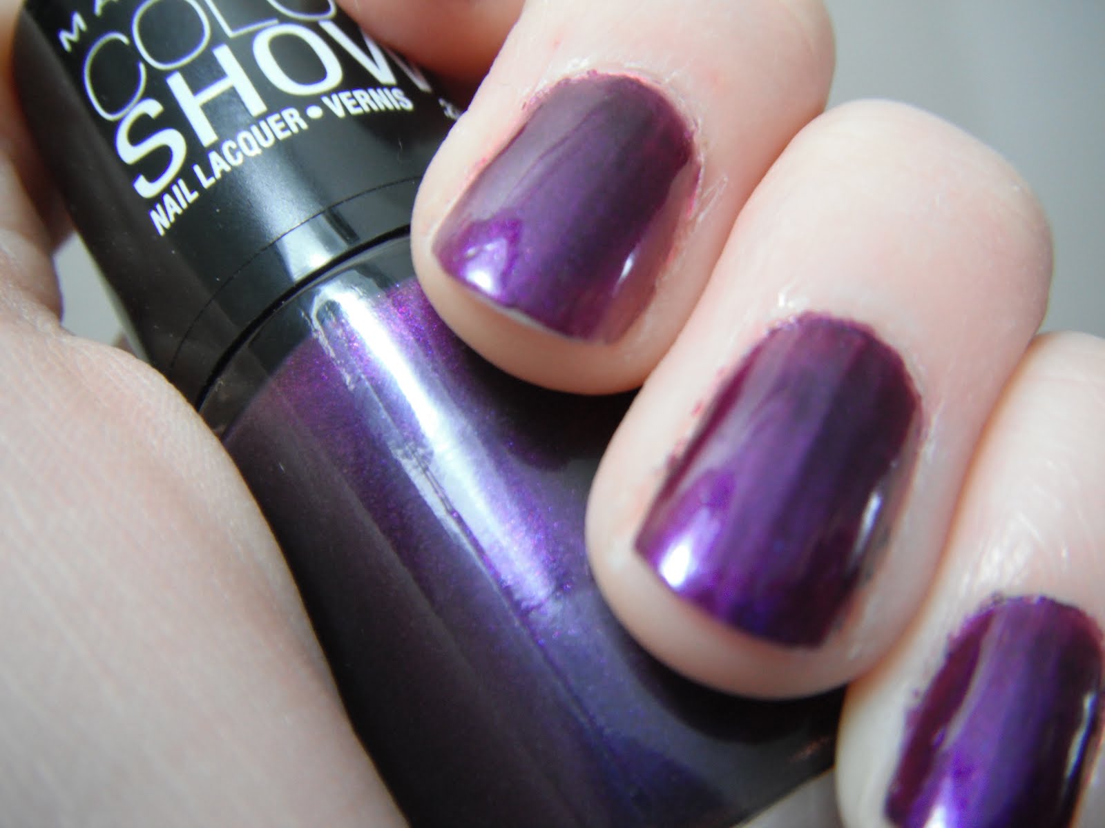
This was a splurge I picked up because I didn't really have any purple in my stash, and I wear a lot of it. I believe that this was on clearance, but it was just kind of tossed in an unmarked bin.
The color is a rich, pearly, royal purple that I love. When it comes to applying it, however, it's a bit of a challenge. For the first coat, I tried to go really thin -- well, that left lots of horrible streaks, and passing over an area that was already painted even a few seconds later was a big mistake. I discovered on the second coat that the best option was to glop it on a bit thicker and then spread it out as quickly as possible.
It does dry quickly, which is a plus, and there's a lot of shine to it. I used 3 coats for these swatches.
I think that Plum Paradise would do better layered with something else--over a black or white, for example. White would really brighten it up and add a whole new dimension to the color, but it would probably also make the uneven application even more noticeable. I wore this color for a day and a half, but even for that short of a time this color didn't really hold up. By the time I took it off, it was showing tip wear on almost every nail (and that's with both a base and a top coat), some of the nails had gouges in the color. It seems that this polish is very soft, even when dry, and just my daily routine left nicks and scratches in the color.
Over all, I'm not impressed. I might continue to use this color (as I said, layered over something else, and probably with two coats of top coat, just to be safe), but I really wouldn't purchase it again and I'm glad I paid less than $3 for it.
It's Friday! That means I get to show off some of the cool stuff I've found lately. Okay, so I've got one new find and one older one, but they go so well together that I had to share both.
The boots are by Blowfish. I found them around Christmas for $10 on clearance. They would have originally sold for about $60-70. They were the last pair left, and they fit perfectly. The shape of the heel took a little getting used to, but I love wearing them. They're just the right height for me. I love the sensible heel, and it is an endangered species. I have no idea where the belt came from since the tag was missing and it doesn't have any marks on it, but it was also on clearance and I found it for $4. Yes, $4. I love the look and the triple buckles, but I will have to add a little bit of ribbon to the inside of it. Because of the way the buckles are set up, the tail that would normally be on the outside and slide into the belt loop on a pair of jeans is on the inside, front and center and has a tendency to slide downwards, which is both uncomfortable and unsightly.
Both of these came from Marshalls, which is one of my favorite places to shop for just about everything. And I think you can see why!
I love these pieces because they are both absolutely perfect for a steampunk costume and they were super cheap and super cute. I'll be sure to share pictures of the costume once I put it together!
Bonjour, and welcome to Girl on a Shoestring, a blog about fashion, manicures, and surviving on half a shoestring budget.
A few things about me:
I’m not a professional. I’m just a retail minion with a manicure addiction who can no longer afford to have them done professionally (Thanks, Sallie Mae). Most of what I do is trial and error, with help from a few online tutorials and other nail blogs.
I’m still pretty new to the world of art manicures, so this blog is as much about me learning and sharing my successes and failures as it is about sharing pretty pictures and fabulous finds.
On this blog, I’ll be showing some the great cheap stuff that I come across, both online and in brick and mortar stores. I love finding hidden treasures in unexpected places, like Target, Marshalls, and the local thrift shop, but I also spend too much time on websites like Etsy, Amazon, and Blogger. Every Friday I’ll be sharing my Find of the Week.
I don't use fake nails.
When I’m not painting my nails or window shopping, I’m reading, writing, knitting, spinning, sewing, and generally making stuff. If you want to know more about that, then you can find my personal blog here.
Thanks for stopping by, and I hope that you come back soon!